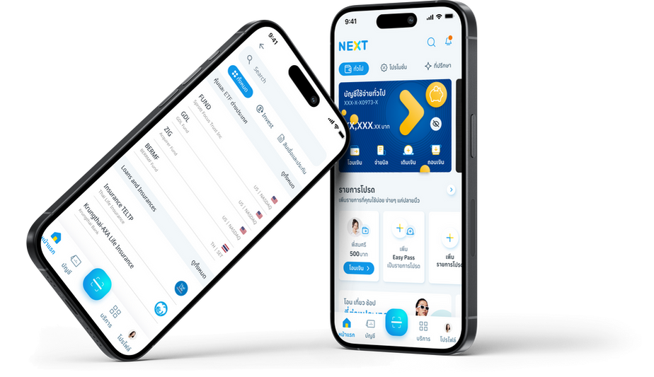
Krungthai Bank, NEXT
Global Search Feature, UX Design

To encourage public participation, KTB wanted to integrate the global search feature for users to be able to navigate them to explore for more opportunities in financials within their existing social security mobile superapp due to its position as the #1 downloaded app in Thailand. While backend integration was simple, the Frontend and User Experience (UX) design was complicated.
Project Goal
The primary goal of the project is to enhance the user experience for Krungthai Bank's more than 15 million Thai users during transactions. This will be achieved by incorporating one key feature into the existing banking system which is Global Search. The overall objective is to streamline and improve the usability of the banking platform, making it more efficient and user-friendly for individuals engaging in online banking, mobile banking app usage, and offline ATM transactions.
KEY CONSIDERATIONS
1. Prioritize the user experience by understanding the needs, behaviors, and expectations of Krungthai Bank's diverse user base.
2. Ensure the integration of the Global Search feature seamlessly into the existing user interface, maintaining a cohesive and intuitive design.
3. Implement an intuitive navigation system that allows users to easily locate and utilize the Global Search features without confusion.
4. Develop user-friendly guides or tutorials within the interface to educate users about the new features and how to make the most out of them.
Role: UX Designer
As a UX designer working with my team, which consists of 4 developers, 1 project manager, 3 UX designers, and 3 UI designers, I conducted user research, competitor analysis, ideation, and created low-fidelity wireframes before handing them over to the UI designers for the next step.
Research Objectives
-
Learn about KTB Next App.
-
Understand why people decide to open a bank account in KTB Next App.
-
Explore how users navigate the KTB Next App.
-
Identify some pain points and unmet needs that users face while using the app.
-
Learn about the experience offered by other banks regarding their digital solutions and their reception.
User Interviews
I conducted user interviews with 10 participants who are current clients of KTB Next App, most of them use multiple banking application besides KTB Next App. We wanted to further understand their motivation and behavior within the app. Additionally, to those who have been clients of KTB Next App for a while now we asked about what they think about the iterations the app has experienced. Lastly, we learned about how they interact with other bank apps and what they enjoy and dislike about them.
Key Findings
-
Users found the current app's categorizations difficult to navigate.
-
Common pain points included complex of information, confusing terminology, and lack of personalized financial insights.
-
Users desired a more intuitive, direct, and visually appealing experience that aligned with their digital expectations.
Competitor analysis
My next step included the competition and testing the competitions app with the research group, I analyzed the features and user experiences of leading mobile banking apps to identify industry best practices and areas for improvement. I conducted competitor research by auditing both direct competitors and some existing applications with a global search feature. The goal was to evaluate their pros and cons, seeking effective solutions that we can apply to our app.

Competitor Analysis - Direct competitor

Existing Analysis - non competitor
User Persona and Empathy Mapping
After consolidating and analyzing the research data gathered, we developed user personas that best describe the demographics of Krungthai NEXT Application users who will potentially have the most advantages from using the Global Search feature in their situations. We targeted a lower mass group of people who are not tech-savvy and not familiar with international applications and technologies. This has scoped our design principles to reduce cognitive load, not display a lot of information all at once, and make it as simple as possible. The design criteria will also need to include design hints and more visual aids because users are likely not inclined to read.
We also captured data on how the user behaves, their attitude towards pain points during the interview and research, understanding the true problems, and formulated an empathy map. We documented what the user says, thinks, does, and feels about the current process. These personas and the empathy map allow both us and the client to be constantly reminded of the people for whom we are designing the product, their needs, wants, and pain points.

User Persona

Empathy Mapping
Information Architecture
Most users were having trouble navigating through the current app and getting overwhelmed by the amount of actions one can take. Therefore, in order to redesign the app, I built the information architecture to understand its structure. Correspondingly, a user flow was generated, outlining the most efficient steps for users to accomplish specific tasks. This approach was applied to the task when users are searching for their results.
Navigation Diagram

Improve User Flow Chart
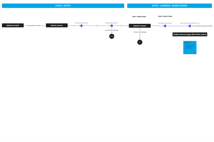
After the research phase, my team and I separately created user flows and implemented solutions to ensure the customer journey runs smoothly during searches. We discussed and decided to consolidate these into one user flow, providing users with a variety of options to help them navigate the results.
User Flow Chart - Global Search


Low Fidelity Wireframe
After discussions within the team about concept ideas that we listed based on user data and auditing competitors and existing solutions, we concluded the final solutions into wireframes. Low-fidelity wireframes were created based on the information architecture, and user testing was conducted with 5 users.


High Fidelity Screens
With the above information, the user research, information architecture and many iterations in the screen’s paper sketch, user testing the screens to make sure the process is easy to understand the high fidelity visual design for the app was designed. Take a look at few of the screens designed below.


User Testing
User testing was conducted with 5 users. Here is the outcome of the User Test:
Task | Task to complete | Easy to complete | Able to complete | Difficult to complete | Unable to complete |
|---|---|---|---|---|---|
Small | Search suggested keywords | Yes | |||
Medium | Type on the field and select results | Yes | |||
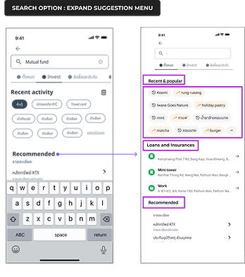
Large | Expanding suggestion menu and select results | Yes |
Below is the conclusion based on observation and feedback of others:
-
All the search screens are easy to understand.
-
Users like the suggested keyword search for exploration and the app is easy to use.
-
Users like the option of expanding suggestion menu.
-
User was able to find the results that we have asked them to find.
Solution: Fast and Easy to understand, and be able to quick access to recently searched history, or compare the financial packages that users are looking for.
Development Process & Next Steps
The product is being developed with dedicated iOS and Android teams. The developers are closely involved in the planning process, and with the design system as a source of truth, the transition from design to code is effortless. Every epic goes through a series of UAT testing on the SIT environment. Each bug is logged, and its fix status is kept tracked through JIRA and weekly scrum meetings. This provides greater transparency between cross-functional teams. The feature of global search is now being built and planned to launch nationwide in quarter 1 of 2024 together with the other upcoming features.